Creative Lead—Design
© 2026
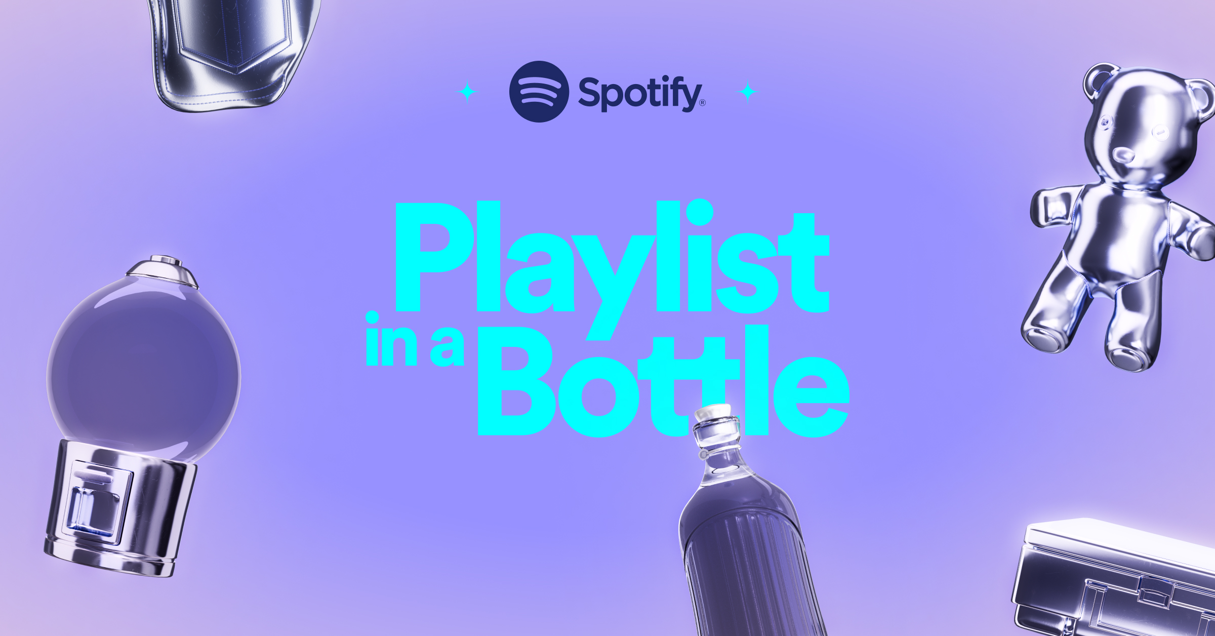
Playlist in a Bottle
︎ Spotify
In-App Experience
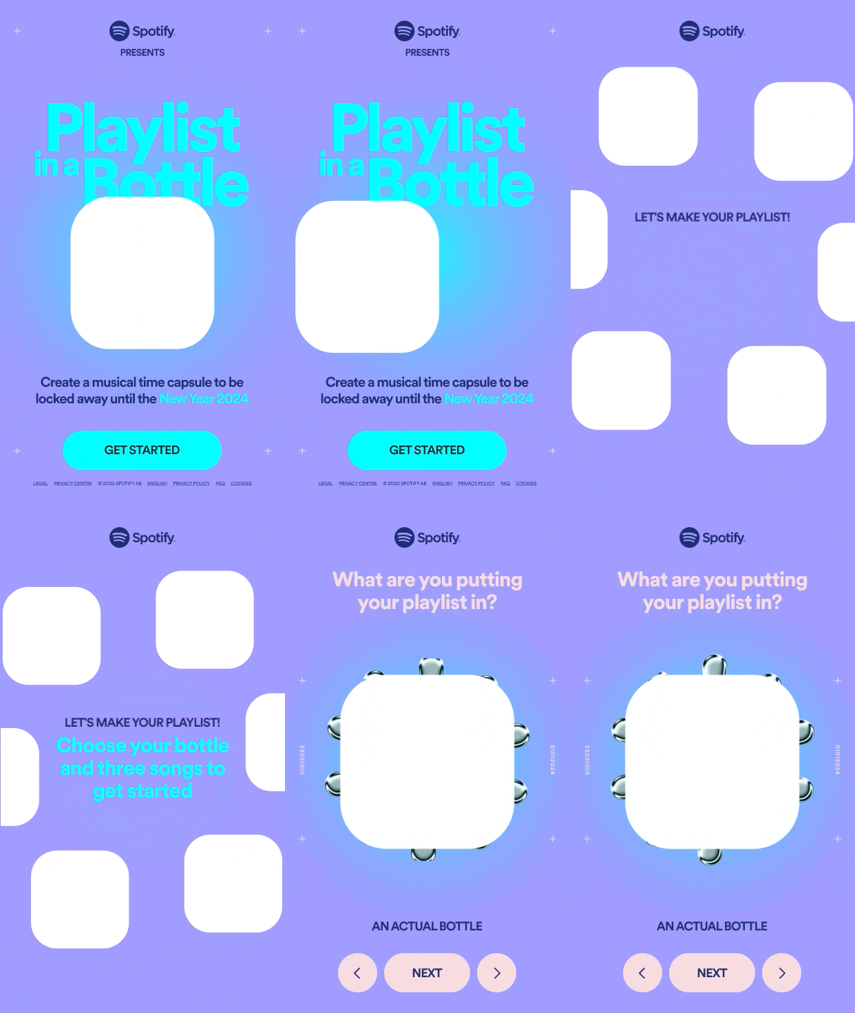
Creating an interactive, in-app experience where you give yourself a musical surprise in January 2024.
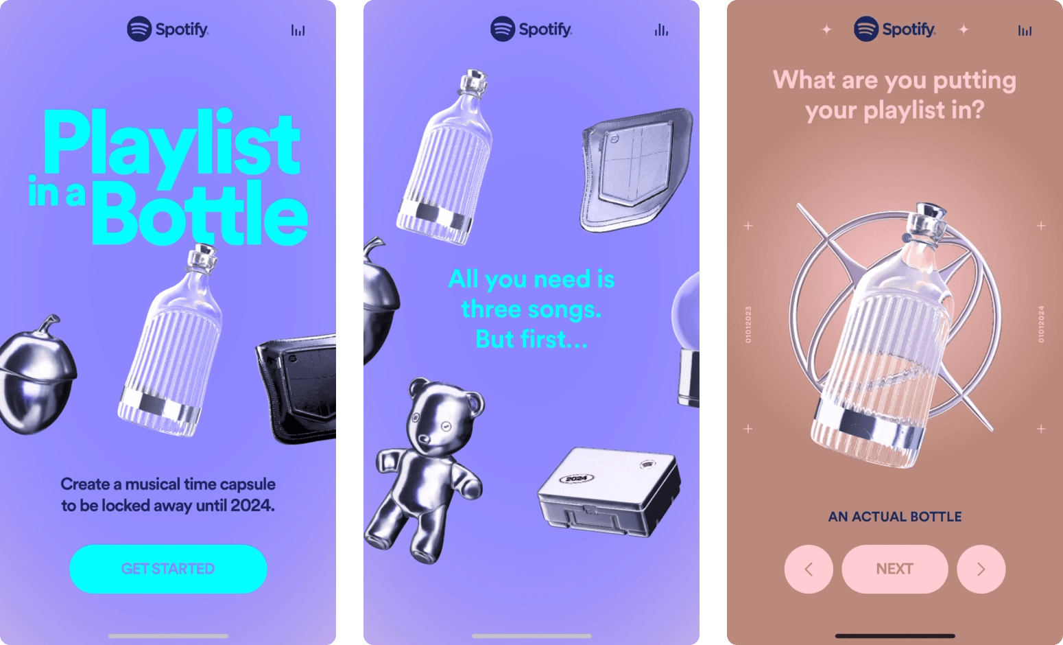
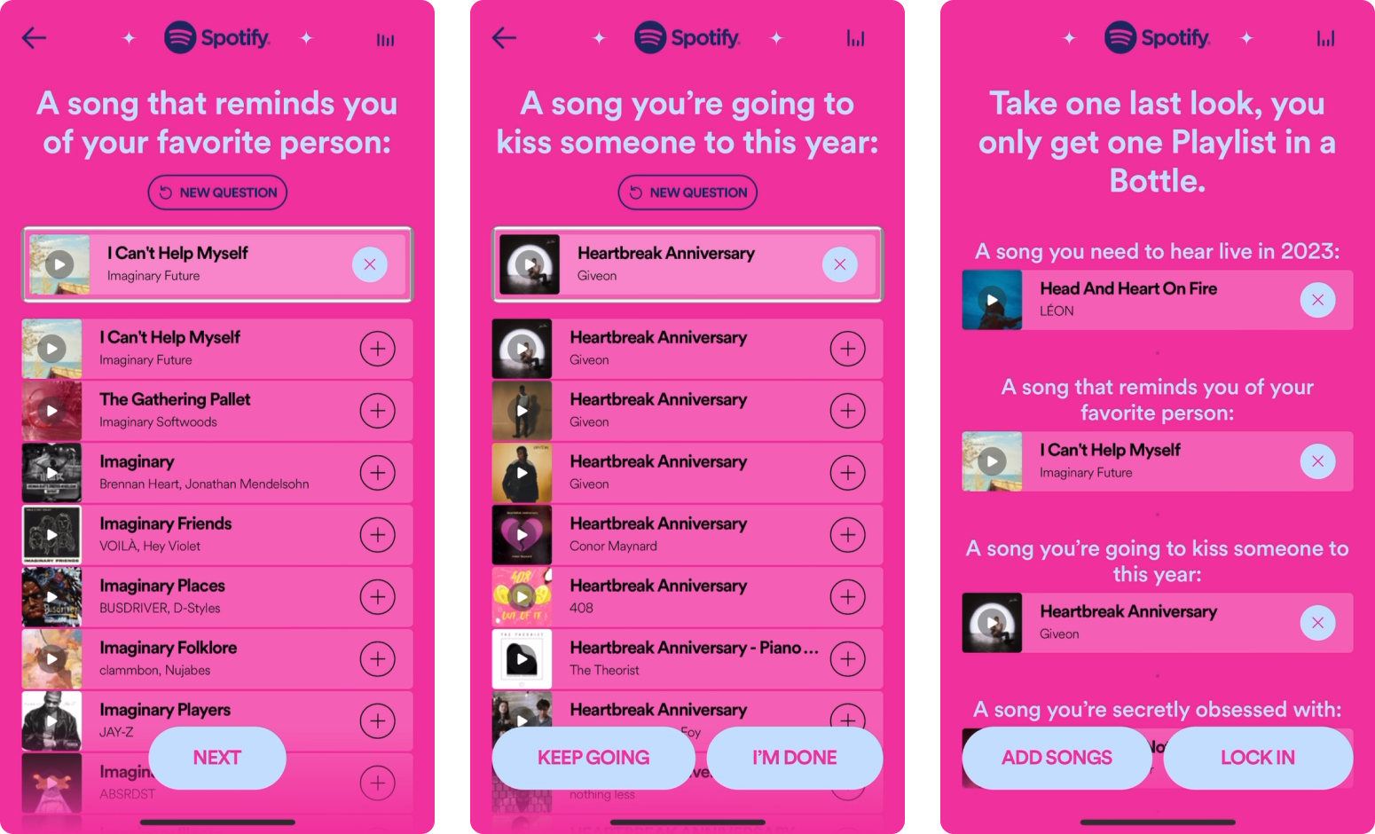
Spotify’s latest experience aimed to tap into that sense of nostalgia with “Playlist in a Bottle”, an in-app and web experience that allows you to create a playlist, only to be locked away until January 2024.
We (Active Theory) partnered with Spotify to help bring their concept to life with a sticky, and delightful digital experience.


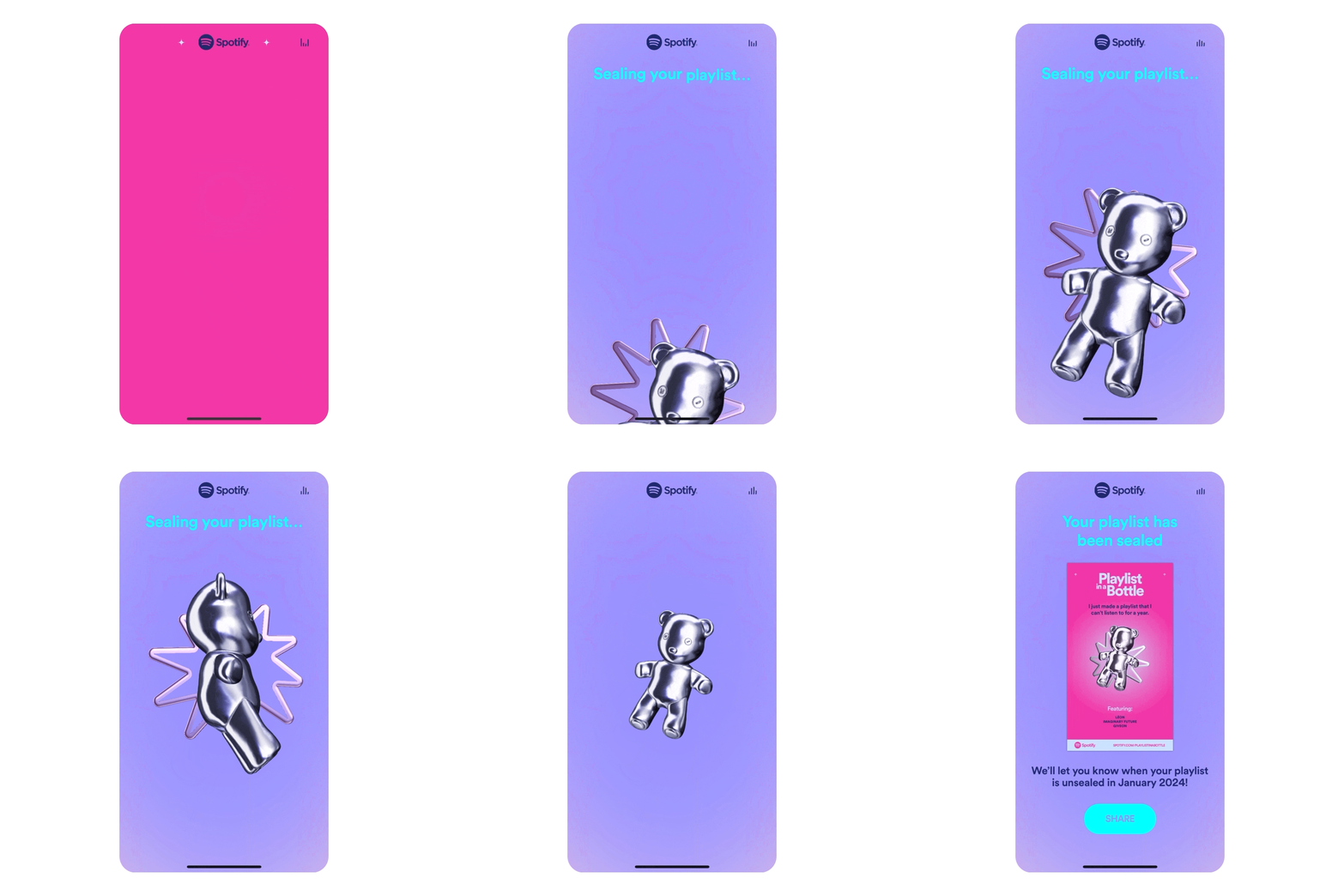
Y2K Aesthetic
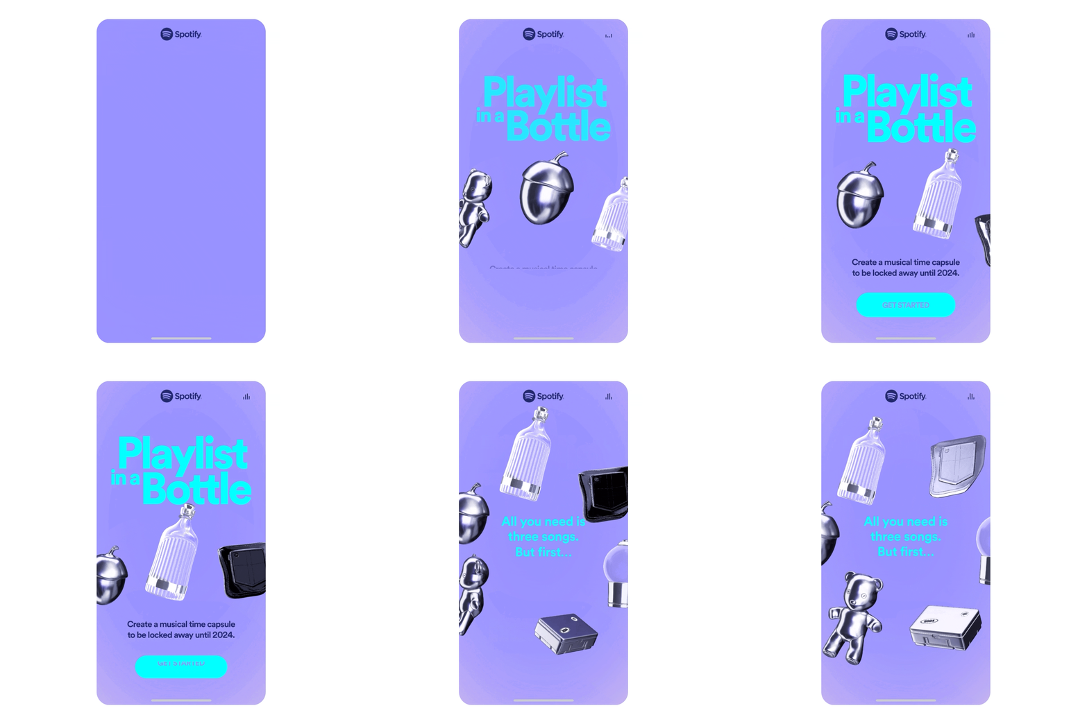
For 3D, the visual direction was going for a “Y2K” aesthetic, tapping into the trend of reviving 90’s pop culture references and styles. We also knew that the priority was the solidify the look and feel of the “Time Capsules”, and for added texture and visual candy, we proposed the addition of “Backing” elements.
As we started receiving soft green-lights regarding 3D, we began to impliment them into our dev environments in order to optimize the models and any shaders that would be applied.
As we started receiving soft green-lights regarding 3D, we began to impliment them into our dev environments in order to optimize the models and any shaders that would be applied.


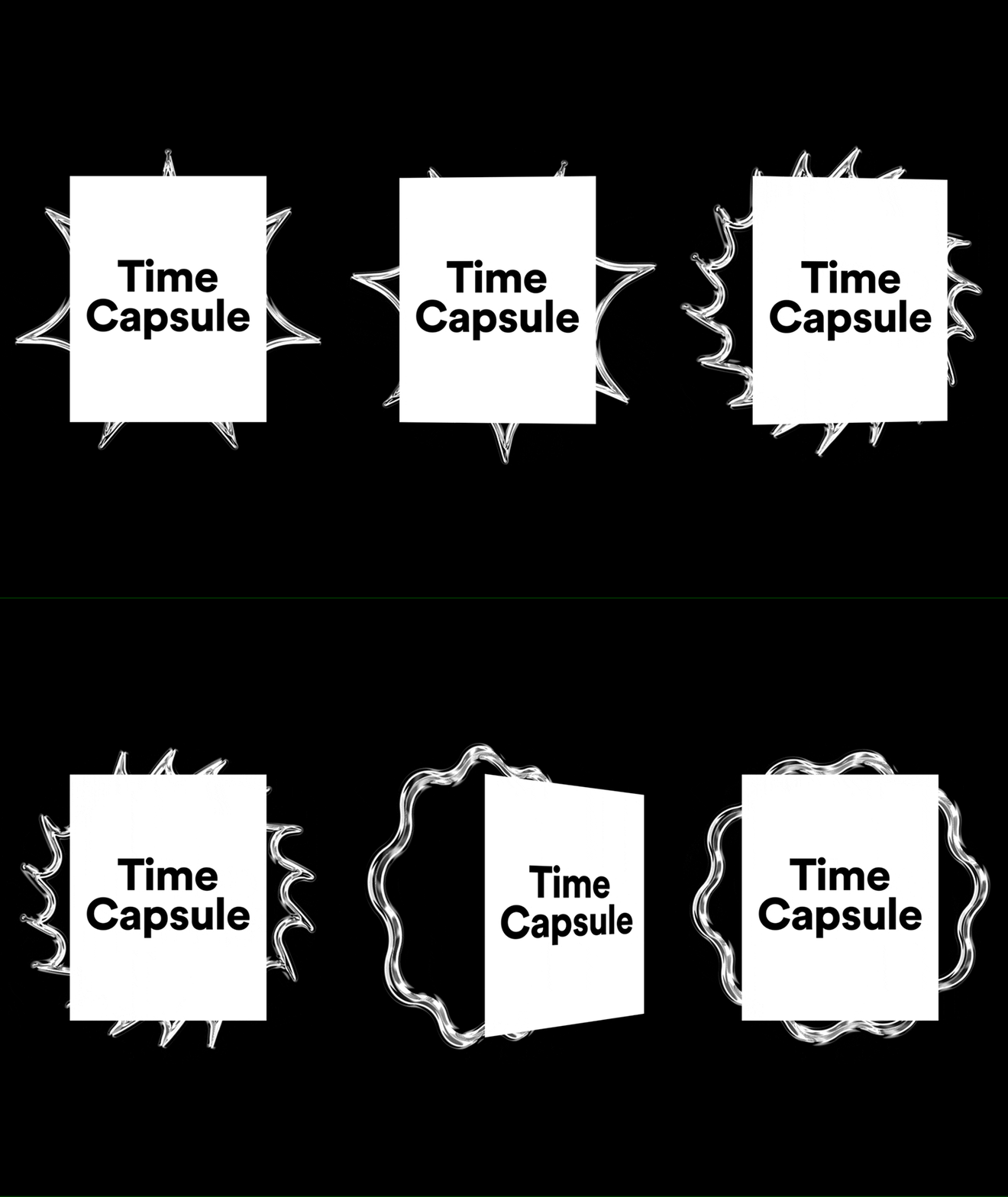
Motion references
This part of the process helps kickoff the motion explorations for all parts of the experience, as well as gives developers a clear guide for how movement should be approached.
I’ll usually try and use basic shapes to represent elements that haven’t been fully realized just yet, and this also helps prevent clients from focusing on the wrong things during design presentations.
I’ll usually try and use basic shapes to represent elements that haven’t been fully realized just yet, and this also helps prevent clients from focusing on the wrong things during design presentations.
Credits
& Recognition
& Recognition
Client
Spotify
Agency
Active Theory
My role
User experience, Direction, and Design
Producer
Jordan F.
Design support
Katie H.
3D
Johannes H.
Developement
Andrew A., Fransisco T., Jonatas S.
Spotify
Agency
Active Theory
My role
User experience, Direction, and Design
Producer
Jordan F.
Design support
Katie H.
3D
Johannes H.
Developement
Andrew A., Fransisco T., Jonatas S.
Creative Lead—Design
© 2026
